Sunday, February 24, 2013

TAIS AniJam 2013 Rough Work

AniJam is fast approaching.  For anyone unfamiliar, the AniJam is a compilation of 10 second animations screened at the Toronto Animated Image Society's Showcase.  The theme this year is "UFO", and since I've had cheeky, B-movie spacegirls dancing around my head for a while, I couldn't not participate.

For my entry, I came up with a skinny, rubber hose-y Martian with a spaceship miniskirt and wrists thicker than her waist.  I love drawing bean pole cartoon characters - especially Snowflake from Heavy Traffic.   

Thumbnails
After thumbnailing out the action, I determined the most difficult part of the animation would be first two seconds.   To begin, I'm working on getting the step and pivot part functional before I move on to the silly hip shakes.

An early pencil test
After doing pencil tests, I found the step was too fast, the hands were weird right before they touched her head, and the hair didn't work at all.  I went back to the animation paper to make fixes.

Getting closer
By adding a couple rough in-betweens in Flash, the movement improved.  Her leg now lifted higher off the ground as she pivoted, and the pivot ends with a quick hip thrust.  The arms wrapping around her head felt smoother and became my favourite bit of the animation.

Most of the clean up I did was in Photoshop with the rest being in ToonBoom Animate.  I can't see where one method starts and the other stops, so I can use either program interchangeably.  As an experiment, I chose to clean her up without outlines.


As I move forward, I'll make three significant changes.  As she pivots, her back leg boils too much.  I will now draw the outlines first, in colour, to catch inconsistencies in volume.  Plus, I'm not happy with her hair.  For this, I will do hair movement studies and redo it entirely.  Lastly, her eyebrows are dancing around her face.  I will redo her brows in white to match her hair.

So far, there are plenty of things I do like.  Almost by accident, I had added a slight, sassy shake to her shoulders as she steps.  As well, the galaxy was lots of fun to paint, and I'll continue painting the background with that texture.  Third, the UFO skirt turned out better than I expected.  Overall, I think she's pretty cute.

I'm feeling confident that I'll meet the deadline.  More rough work to come.

Friday, February 22, 2013

Making of a Toons On Tap Poster - Session 24: Beetlejuice

Back in school, my animation teacher Joe Sherman taught me how to kern type.  It blew my mind.

Nowadays, I'll fiddle with the spacing between letters at any opportunity.  I'll kern when doing logo design.  I'll kern when making a birthday card for my dad.  I'll even kern when typing an application to Harvey's.  However, I look back at the last poster I made and there was such a wide gap between the "h" and "a" in Charlie that I could have moonwalked through it.

For the Beetlejuice poster, I decided, the text shall be spectacular.

Text is usually the weakest element of every Toons On Tap poster.  Unless Jeremy or I are outright plagiarizing Kanye West, we barely know how to choose a typeface.

My apologies to Mr. West.
I borrowed a copy of Design Elements, Typography Fundamentals from my nearest library and got to work.

To begin, I decided to recreate the title and tagline of the Beetlejuice movie poster.  I placed two restrictions on myself: 1) don't Google "Beetlejuice font", and 2) stick to fonts I already had in FontBook.

The original
First, I attempted the title without reading the typography book.  Since I made it at 4 a.m., I thought it was flawless.

First attempt

Of course, I opened the book and learned I didn't know why "&" represents "and".  (It is a ligature of "et"- the Latin word for and.)  Time for round two.

The biggest mistake I made in my first attempt was stretching a squat font vertically rather than using a more versatile typeface.   If possible, I wanted only one typeface throughout the whole poster, with changes in size and boldness.  My second big mistake was using a font with a high thick-to-thin stroke contrast.  The "N" and "A" especially look too thin to resemble the original.

Next, I went through my serif fonts and found three that fit the bill: the "J" ends with a terminal, the stroke contrast is medium, the serifs are wedge shaped, and the serifs are bilateral (on both sides).


I decided on the font superfamily Arno Pro.  Back in elementary school, having the options bold and italic lead to hours of tweaking in WordPerfect.  Now, I get to play with "caption" and "italic caption" and "semibold italic caption".  It's nuts.

Toons On Tap looked like this in Arno Pro:


Forgetting what I just learned about not stretching type, I did just that:


Next, I studied the tilt and position of the letters in the Beetlejuice title.  Before, I had assumed the letters were much more tilted then they were.


I rasterized my text, and one by one tilted and positioned the letters.


In the tagline, I noted that every word was capitalized.  Using different font styles, I created slighter bolder, slightly larger, capitals on each word.


To further the movie poster feel, I included the models' names.

The final image

Unlike my first attempt, I decided against adding a rough look to the text.  Jeremy had coloured the art in a very clean, cartoony style.  The text, we decided, should also be clean.  

In the end, I have no idea whether my first attempt and final image look noticeably different.  If the team and I end up doing an American Psycho night (we've wanted to for a while), I know I'll be the one comparing nearly identical business cards.

Tuesday, February 19, 2013

The Experiment Continues


Jeremy makes a surprisingly good art model.

For this round of gestures, I used a brush pen on animation paper.  Next time, I'll draw within the camera safe area of the paper so I can scan the drawings in properly.  

Although, the upside to this quick and dirty method is that the barriers to testing my keys (e.g. small scanner, too time consuming to scan, no tripod or animation camera) are removed.  I love animating, but find myself animating less because of dozens of tiny inconveniences involved with animating at home.  Now, there are no excuses.

Saturday, February 16, 2013

Saturday Life Drawing Experiment

Lately, Jeremy has been religiously studying Richard William's Animator's Survival Kit.  If you were to call him at 3:15 A.M., on any random day of the week, chances are he is buried in the book with a mountain of notebooks beside him.

In the life drawing section of the kit, Williams recommends having a model take a series of brief, sequential poses.  As the model poses, draw the gestures on animation paper as if you were keying a scene.  Jeremy's face lit up like birthday candles and we couldn't not do it.

We took turns posing in sequence this afternoon, and below is the result of mine.


The experiment was fun, and so far, I can think of two applications for it:

1) To rough out difficult animation movements

2) A warm up exercise for upcoming Toons On Tap sessions

In the beginning of Toons, we did include segments of sequential poses.  Models David McKenna and Patricia Lewis (my sister!), specifically, would create thumbnail drawings of their sequential poses in advance and take the drawings onstage with them.

At this point, I'm deathly bored of cafe sketching and couldn't bear to draw another boring person with a latte.  Maybe I can convince my friends to hang out over beers and peg bars to do more of this exercise.

Monday, February 4, 2013

Making of a Toons On Tap Poster - Session 23: Film Noir

Most of the time, the Toons On Tap event posters are a collaboration between Jeremy and I.  Jeremy had the added challenge of trying to draw like me.  Or, more accurately, listening to my critiques on how to draw like me.

For this upcoming session, we are bringing back one our go-to models, Sion Irwin-Childs, to play a Humphrey Bogart style detective.  Sion is a joy to work with because he involves himself in the creative brainstorming, and he thoroughly researches the source material beforehand.  Ask him to be Conan, and he poses like he jumped out of a Frazetta drawing.


Photo courtesy of Toons On Tap photographer Jeffrey Adam Danyleyko

With the theme being melodramatic, booking a second model for interaction was a necessity.  Considering the recent improvement in attendance, we are planning more sessions with multiple models.   The second model for this session is the charismatic dancer and burlesque performer Charlie Quinn.  Charlie’s “Somebody Stop Her” act caught our attention, making her the obvious choice for the booking.


The scenario in our heads for the session is of a wealthy widow hiring a jaded private eye.  For the poster, we wanted Charlie lounging barefoot at Sion’s desk and Sion looking very unhappy about it.  Jeremy drew Charlie’s pose, and I drew Sion’s face.


Then, I began digitally painting each model separately.  I referenced the Sin City film for lighting, specifically the scene with Hartigan realizing he lead the Yellow Bastard to Nancy.  I liked the extreme detail on his face compared to the looseness of Nancy in the background, and how the colour drains out of the scene.  Plus, I wanted to add yellow to the poster, using the colour boldly in the text and subtly in the highlights.


I began each model with blocking out the lighting in pen.  Especially in Charlie, the lighting changed as I progressed.


The rest was painted with a round, hard edged brush and a custom hair brush on Charlie.  Textured brushes weren’t used until the end, and even then, just for the background.


While I worked away at painting, I tested out possible compositions.  In the end, I decided to make the poster horizontal like a film card.


I finished the poster with one week to go before the deadline.  At each Toons On Tap event we promote the following session.  In order to promote, the poster for the next session needs to be sent to the printers the night before.  To reach that deadline, we need to book models a minimum of four weeks in advance from their sessions.

Now, to start the poster for Beetlejuice night...


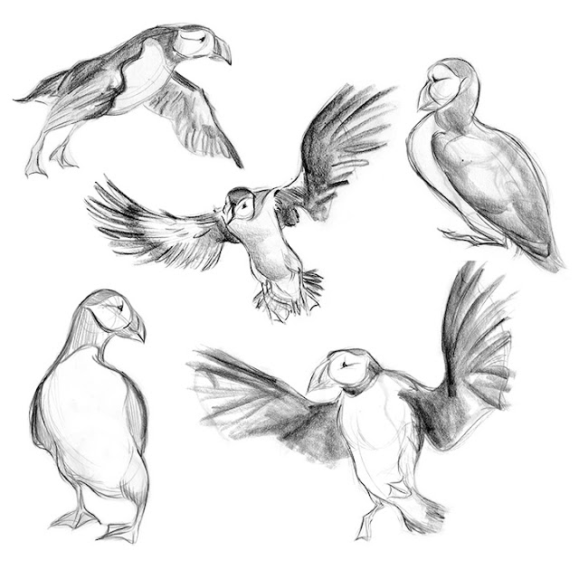
Puffin Observations

Before starting work on a game at Wero Creative about puffins, I was warned that watching videos of the adorable little birds is addictive.  Adam Clare, you were right.


At first, I did studies from the videos, getting a sense of how the birds are built so I could cartoon them later.  Then, I started to notice the quirks of their behaviour and movement.


While watching this video, I noticed one puffin walk upright with its chest arched out, while the other puffins around it scuttled by with hunched backs.  (It starts at 3:13.)  


My assumption was that one puffin was displaying power to the other subordinate birds.  The raised chest and beak pressed firmly against the body reminded me of Don Draper in every meeting ever, and a real life fellow I know named Fred who walks through life with his chin against his neck.


After doing some research, I learned the pose is not a display of power, but a sign the puffin is a parent.  Puffins raise their young in burrows, so groups of adult puffins will stand together outside to guard the nests.  When a puffin is around its own burrow, it walks around ‘on guard’ with slow, deliberate, upright movements.  The other puffins take passive, hunched over poses to show they mean no harm.

This low profile pose occurs again when a puffin lands on another puffin’s property.


After landing, it does a little curtsy.  Head low, foot out, wings up.  Puffins need to group together for safety, so their social behaviours communicate non-hostility.

Also, I noticed the birds are constantly twitching and twisting their heads around like little Linda Blairs.  I hear puffins are tasty creatures, and I imagine their vigilance is in direct proportion to their deliciousness.


Puffins do a little antic before they poop (above image, bottom right).  It’s adorable.


Lastly, puffins sound exactly like chainsaws.  I need to find a way to incorporate this in the game.


Making of a Toons On Tap Poster - Session 21: She-Ra Princess of Power

It began with a rather ugly Christmas card.

What you can expect in the mail from me at Christmastime

The subject was the delightfully offensive drag performer Daytona Bitch.  Jeremy and I had made dirty Christmas cards to sell at Red Herring’s Reveal Me at The Rivoli in December.  Of the four cards I made, the shiny lipped, beady eyed caricature of Daytona was my favourite.

I was unsure how she would react.  At this point, I had seen Daytona at previous shows eviscerate hecklers with her biting wit.  I prepared myself to be torn a new one.  And yet, I hadn’t expected how Daytona actually reacted- with joy. She loved the cards, especially the ugly one.

Red Herring highly recommended Daytona as a potential Toons On Tap model.  When a performer meets Red’s high standards and earns a recommendation, we take notice.  Jeremy and I researched Daytona after the show, and found she had a She Ra outfit among her costumes.  It was love.  The very next morning, we booked her for Toons.

For the event poster, I wanted to create the feeling of heavy metal album art.  If Toons On Tap was a dictatorship and not a team effort, every single session would feature drag queens and metal music.  To begin research, I sketched out the compositions of various albums and fantasy art.


I decided to make the poster square, like a vinyl cover, rather than the usual letter size.  "Toons On Tap" would be placed across the top like a band name, with the model's name positioned in a bottom corner like an album title.  Importantly, I knew I needed enough negative space to place the event info.  The image I had in mind was She-Ra menacingly posed on a jagged cliff against a night sky and a full moon.

I grabbed a toy sword and had Jeremy takes reference photos of me trying various poses.  The pose I decided on had interesting angles and fun foreshortening... and yet, I had one big problem.  In an effort to avoid cheesecake, T&A poses, I ended up with a rather angry pantyshot.  Should I alter the costume to be more modest?  Would She-Ra wear booty shorts under her dress?  Or, should I give the Princess of Power a hefty package?  I would revisit this later.

Next, I drew the pose and tested the composition and colour in Photoshop.  This first draft was eye bleedingly bad.

Ick
Poor She-Ra had giant banana hands, and was standing on rocks the colour of an ugly insurance office.  The cheery, Saturday morning colours of her costume looked silly against a purple and black sky.  I still wanted the image to look ‘metal’, but I decided not to use a dark background.  Just ask my poor teachers- it is nigh impossible to get me to stop using black.

I thought back to the albums I looked at while researching, and one in particular came to mind.

Colour can be metal

Rather than set the white and gold She-Ra against a dark sky, I decided to put her in the heat of a midday sun.  As an added bonus, I found the solution to the upskirt problem- the lighting!

So, round two.


Much happier with the colours, I spent the next week of evenings hunched over Photoshop. The poster was birthed.

Jeffrey approved of my use of the Megadeth font

Overall, I had far too much fun making this.  My favourite part to paint was the red jewel in the sword as I had no idea what I was doing and it still turned out how I wanted.  If I were to redo the poster, I would draw She Ra to resemble Daytona more strongly.  I’m not sure if the facial features and large feet read as the character being a drag queen, or if She-Ra just looks like a strange looking woman.  Plus, I’m still not happy with the hands and will focus on improving my hands in future posters.

As for the session?  Daytona Bitch was a flawless She-Ra.

Photo courtesy of Toons On Tap photographer Jeffrey Adam Danyleyko